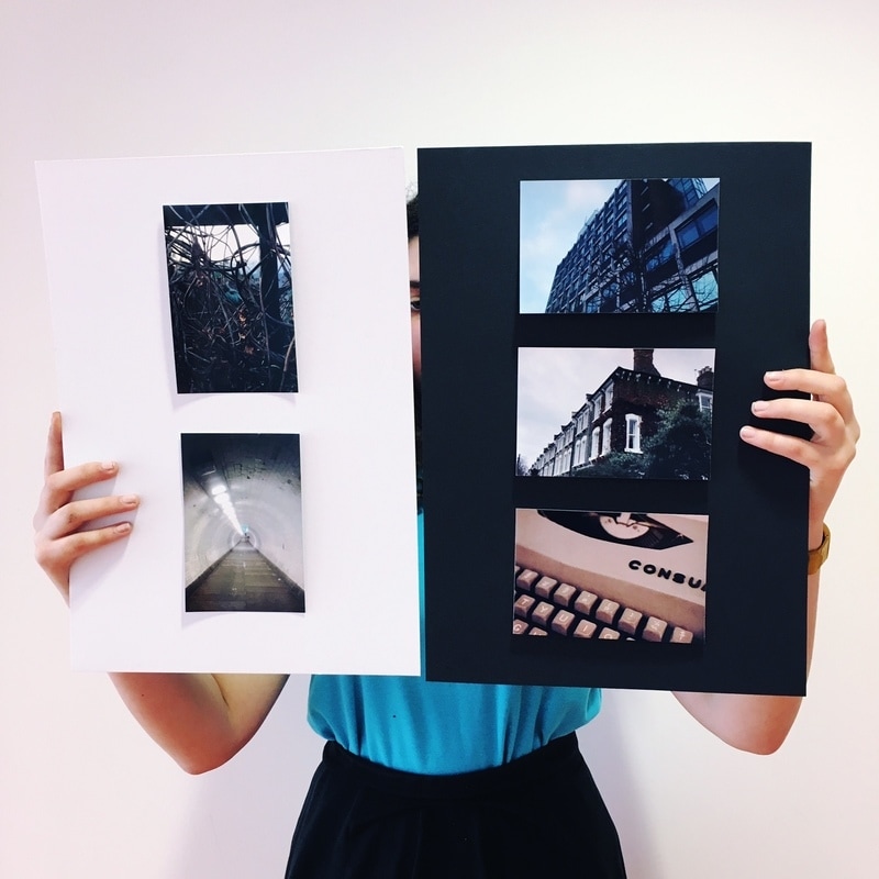
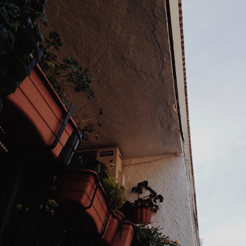
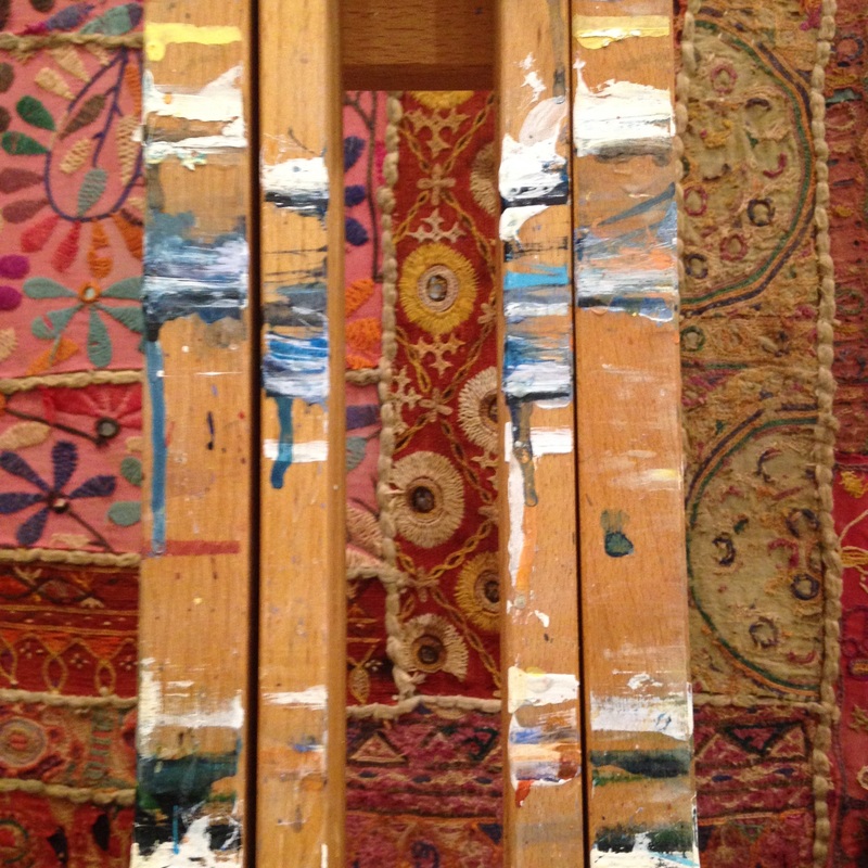
For my photography exhibition, I decided to hold it in my kitchen, on the mantle piece. I did this because I liked the way it looked and there were many edges so it fit the theme. I found this project very fun and I enjoyed showing my family all the work that I have been doing inside and outside of school. They gave me some constructive feedback:
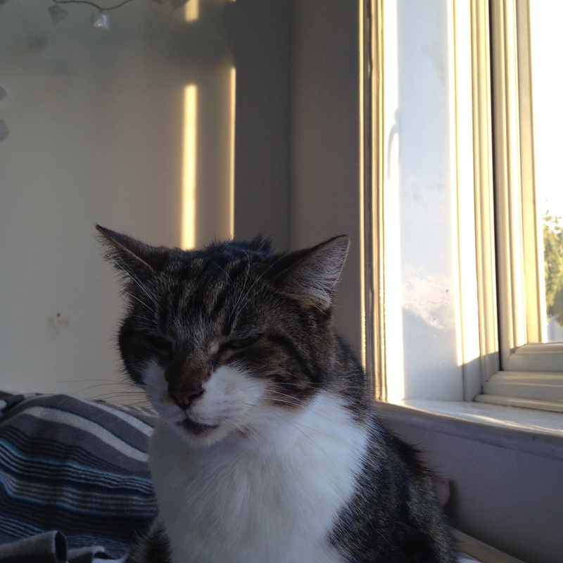
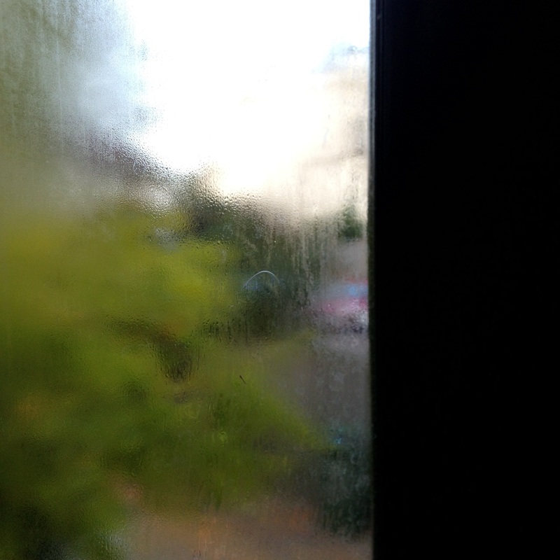
My mum said: I like the way you found edges in everyday objects and my favourite picture was the one with window. I found that it was very interesting as I like the way that the glass makes the outside very blurred but where theres that open bit of window you can see that everything outside is clear and sharp.
My sister said: I like the one with the books 'cause the books were in focus but the rest was blurred and I think thats cool and I liked the edges in it.
My dad said: The pictures were good, I particularly liked the way she juxtaposed the dark pictures with the bright mantle piece.
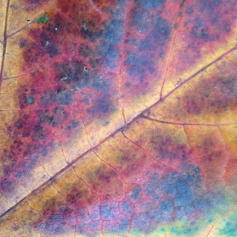
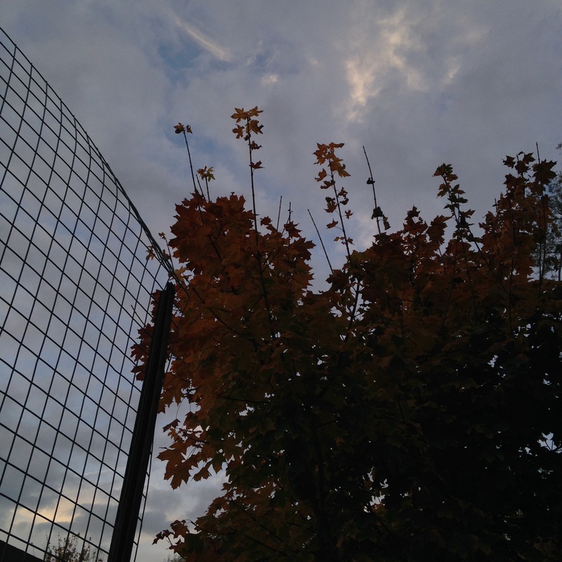
My personal favourite picture is this one because it looks quite magical and you can see the faintest bit of mist in the background and it feels very autumnal. I also like the perspective that its taken in.
My mum said: I like the way you found edges in everyday objects and my favourite picture was the one with window. I found that it was very interesting as I like the way that the glass makes the outside very blurred but where theres that open bit of window you can see that everything outside is clear and sharp.
My sister said: I like the one with the books 'cause the books were in focus but the rest was blurred and I think thats cool and I liked the edges in it.
My dad said: The pictures were good, I particularly liked the way she juxtaposed the dark pictures with the bright mantle piece.
My personal favourite picture is this one because it looks quite magical and you can see the faintest bit of mist in the background and it feels very autumnal. I also like the perspective that its taken in.
Half-term homework
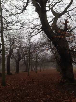
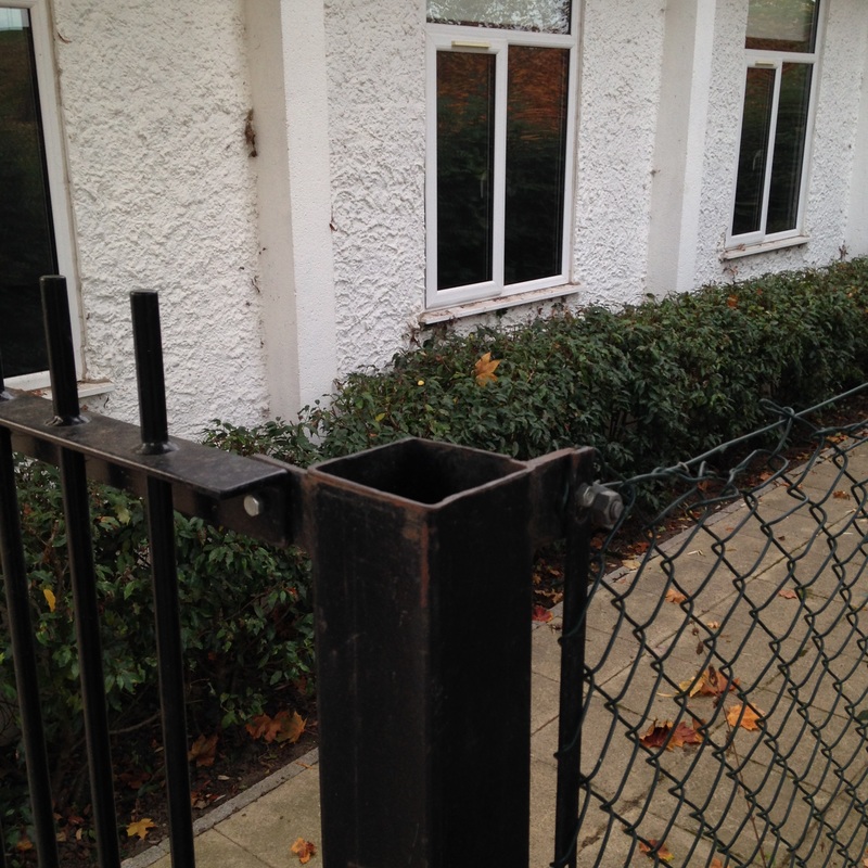
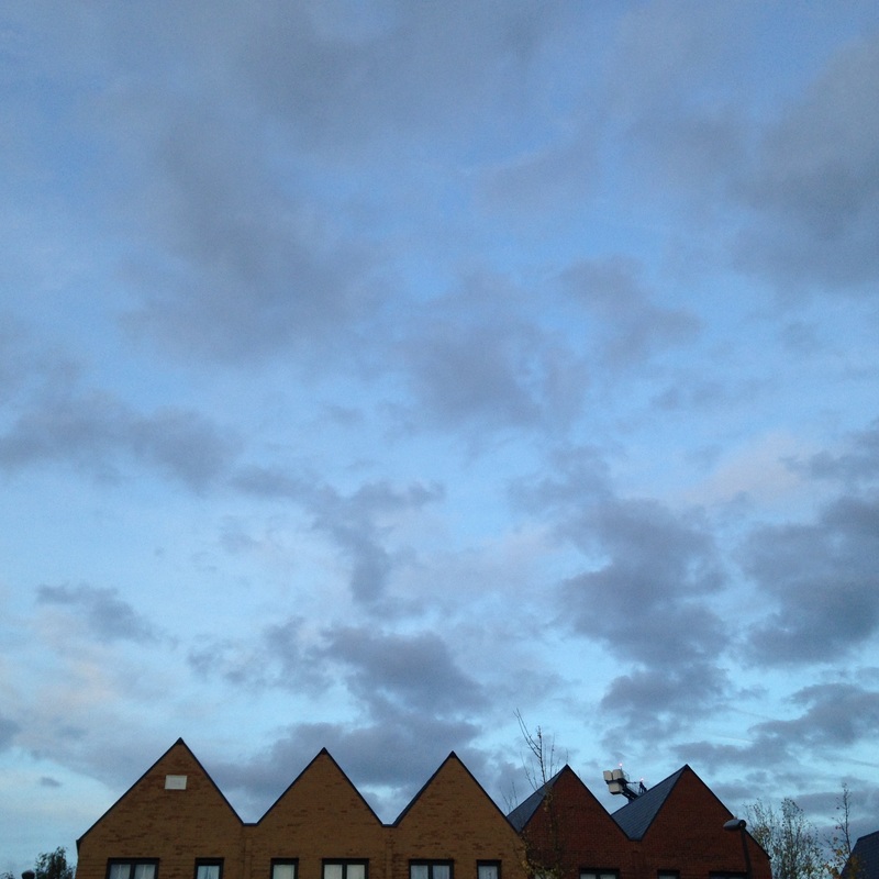
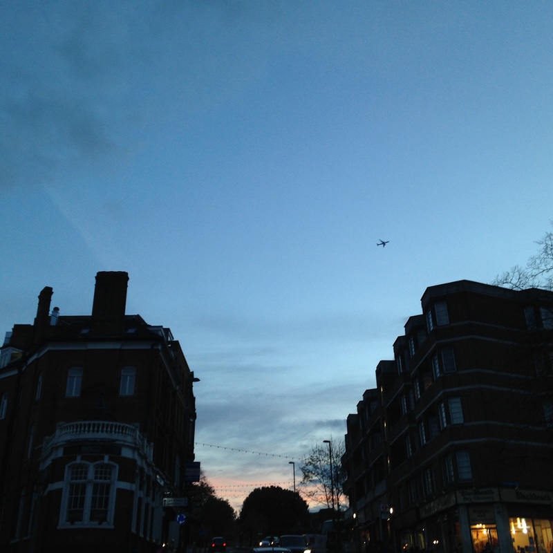
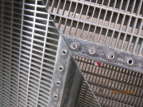
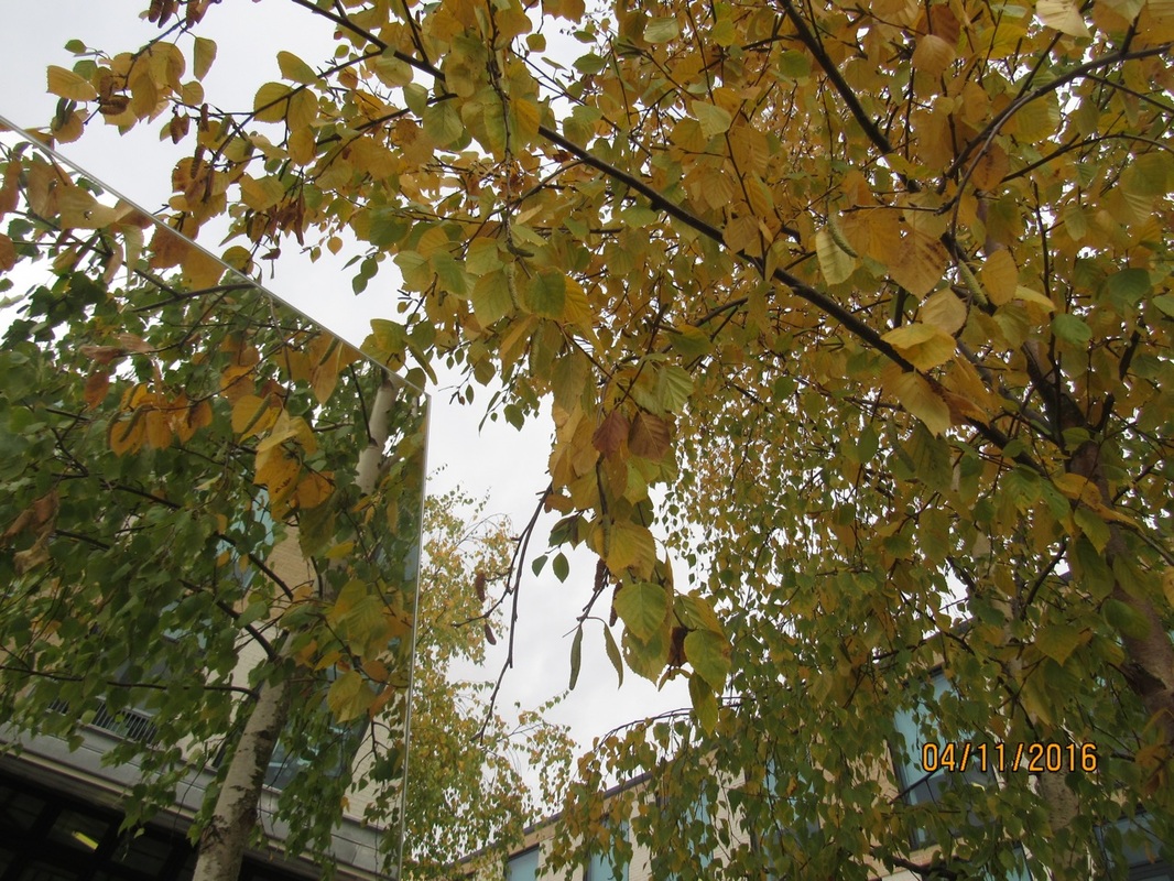
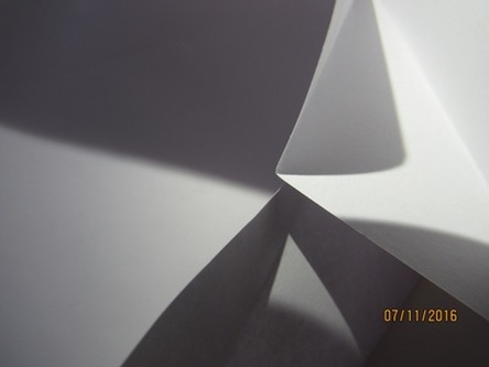
For our half-term home work, we were given the task of taking photos of edges. However, this was a difficult task because in real life not many things have an edge. But whe you take photos of objects, the object gets flattened, creating edges that don't exist in real life.
|
|
|
|
|
|
|
|
|
|
|
|
|
|
|
|
|
|
|
|
|
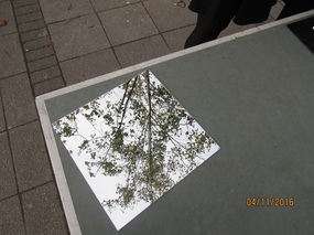
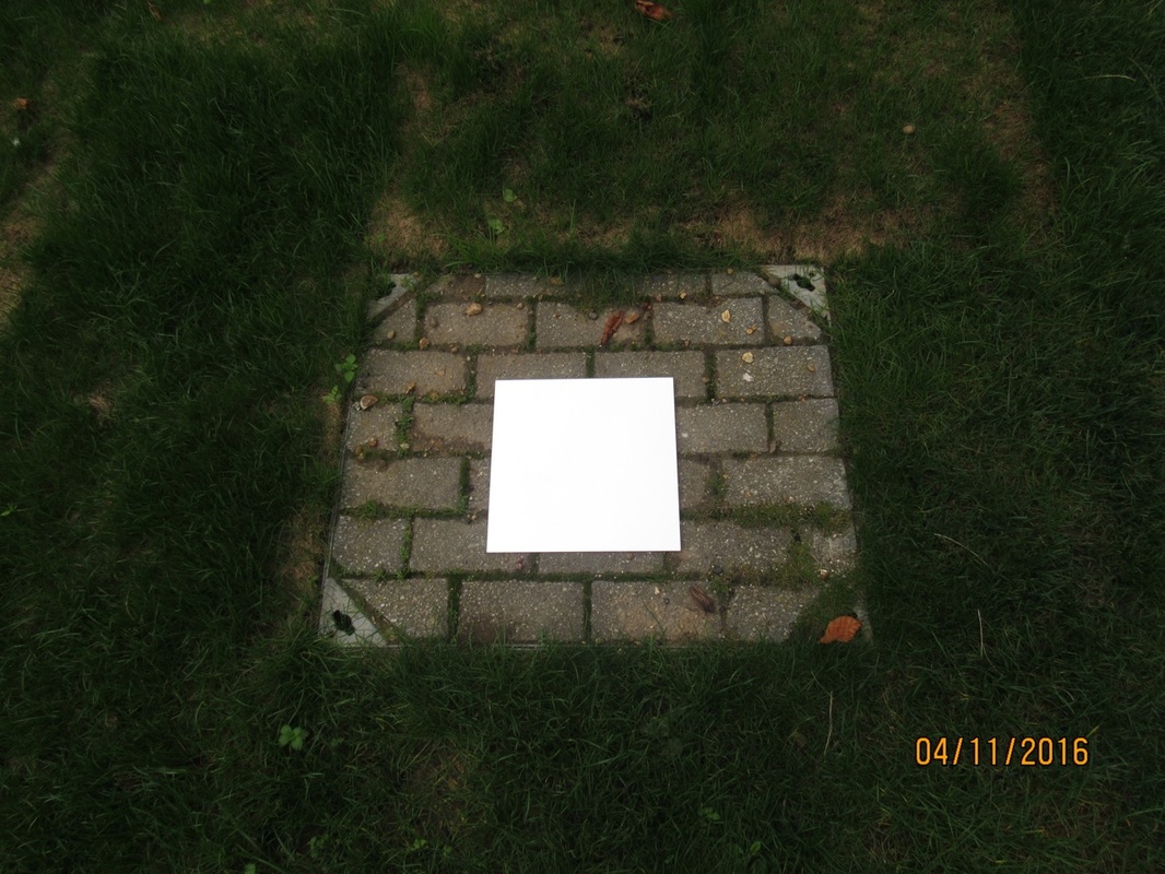
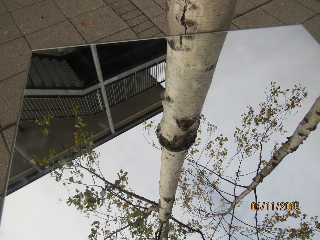
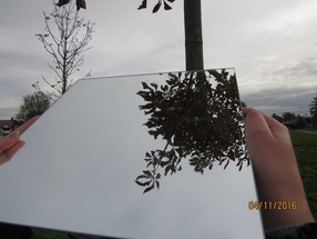
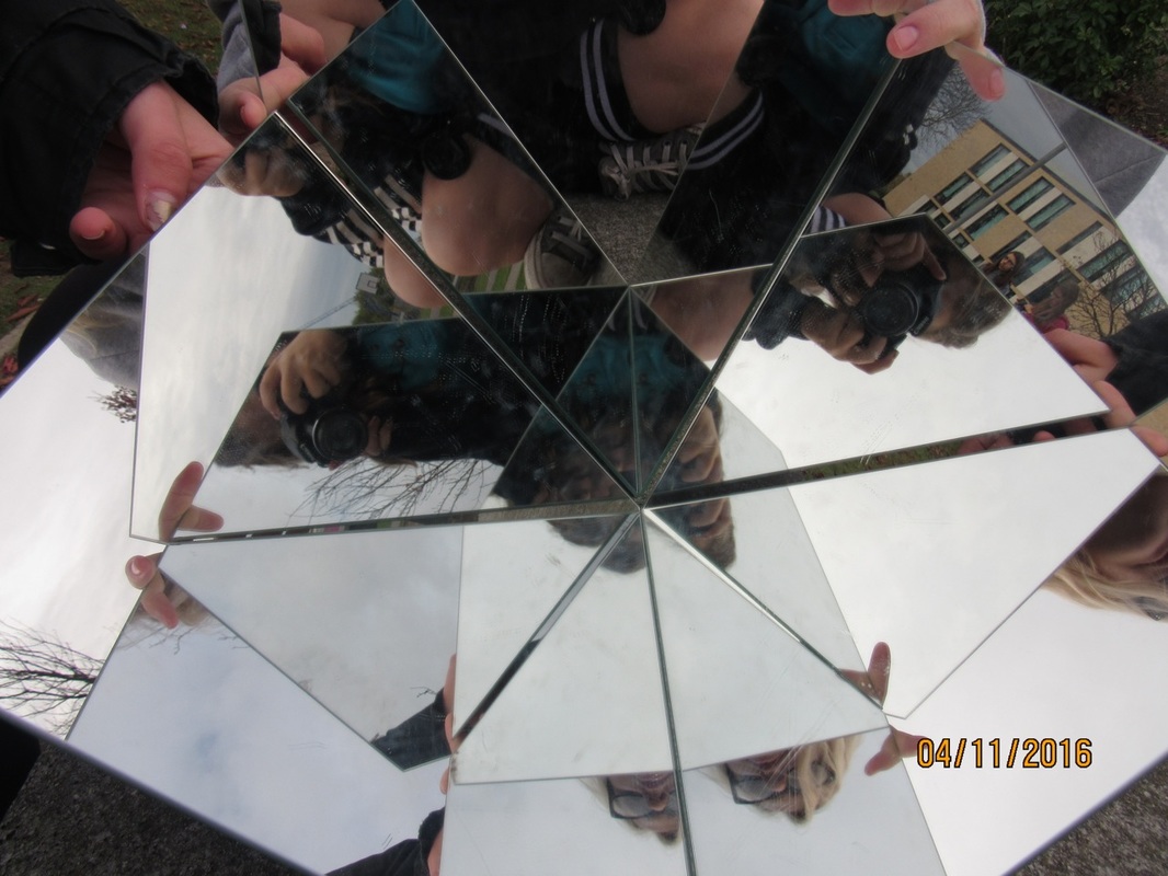
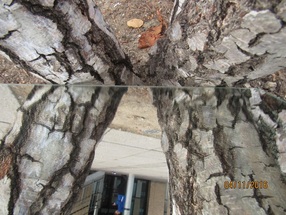
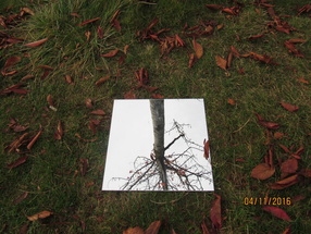
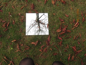
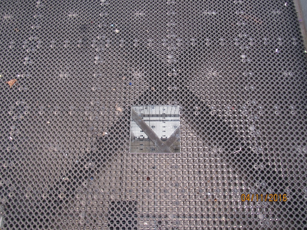
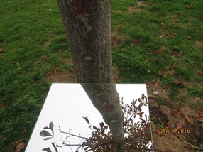
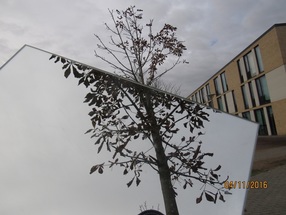
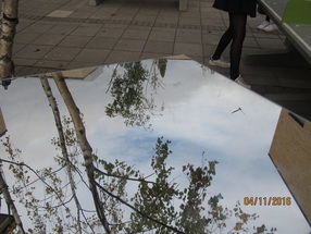
Mirror Edges
We made these photos by taking a square mirror outside and putting it in interesting places. We then took the photos. This was fun because lots of the photographs look like something out of a dream.
WWW: I like how some of the photos look like a portal into another world.
EBI; If some of the of the photos had more ineresting subjects.
WWW: I like how some of the photos look like a portal into another world.
EBI; If some of the of the photos had more ineresting subjects.
|
|

|
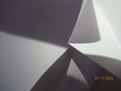
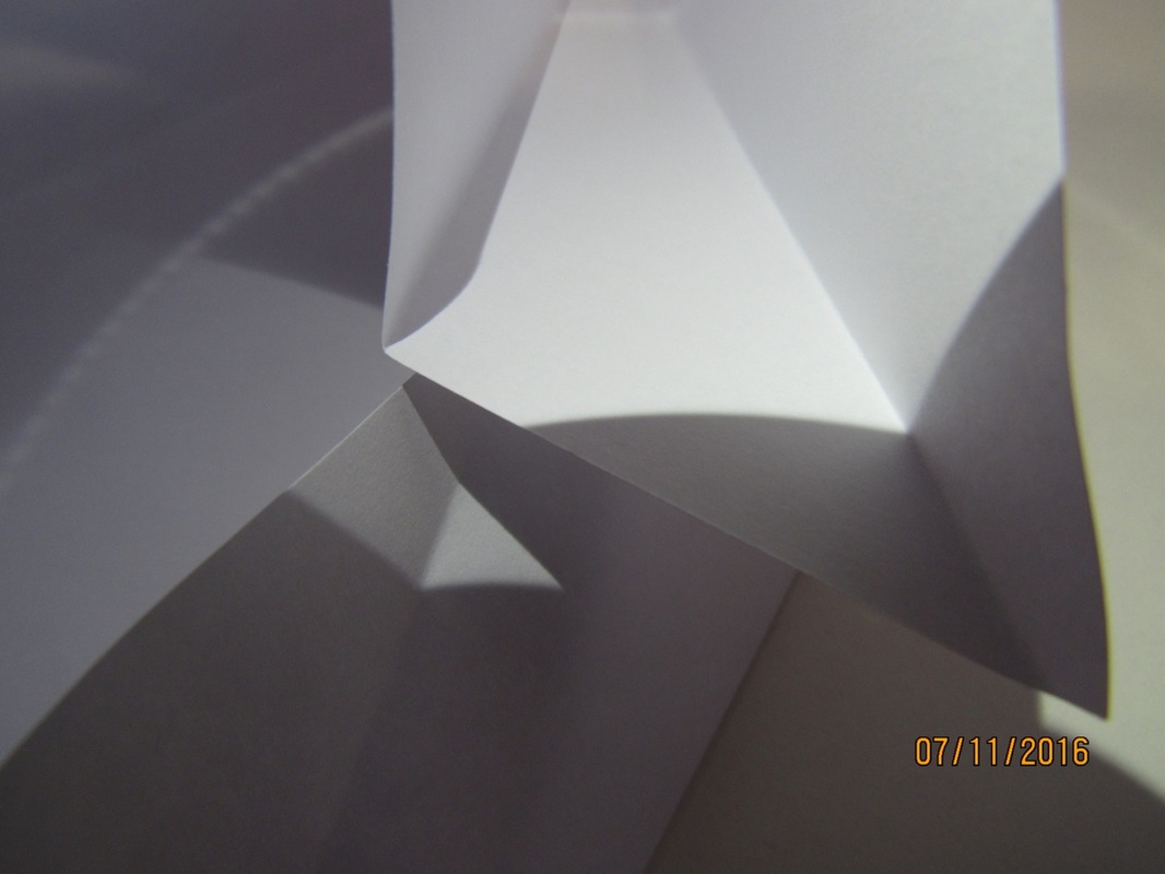
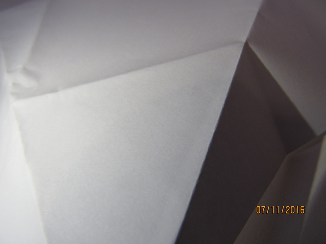
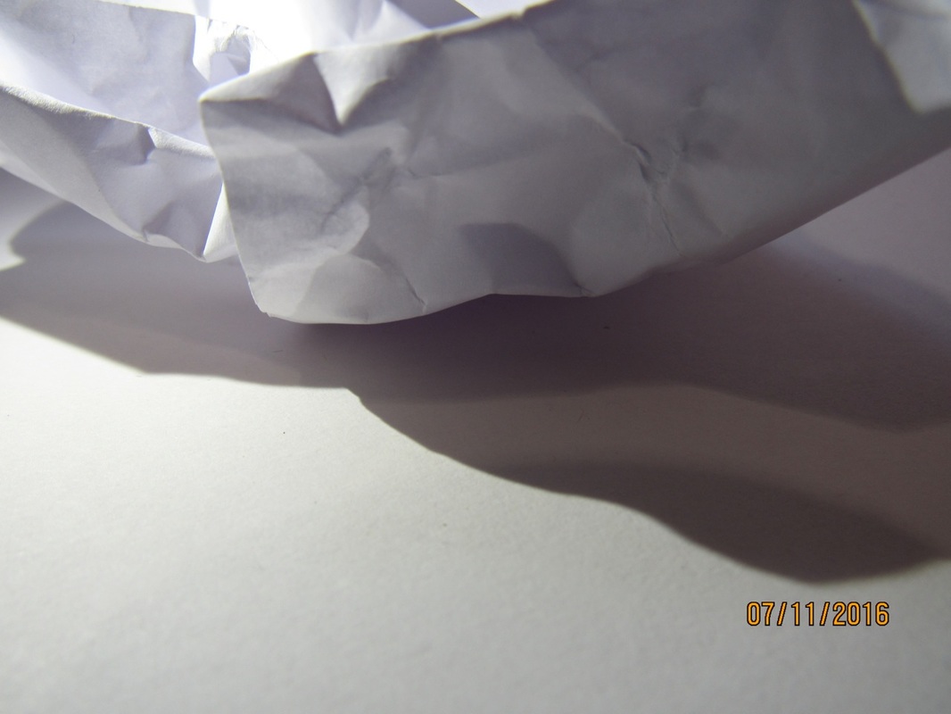
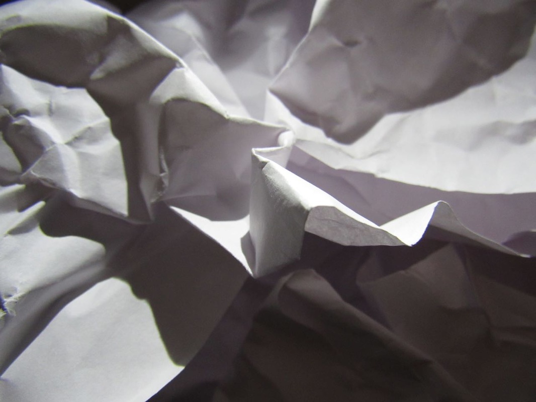
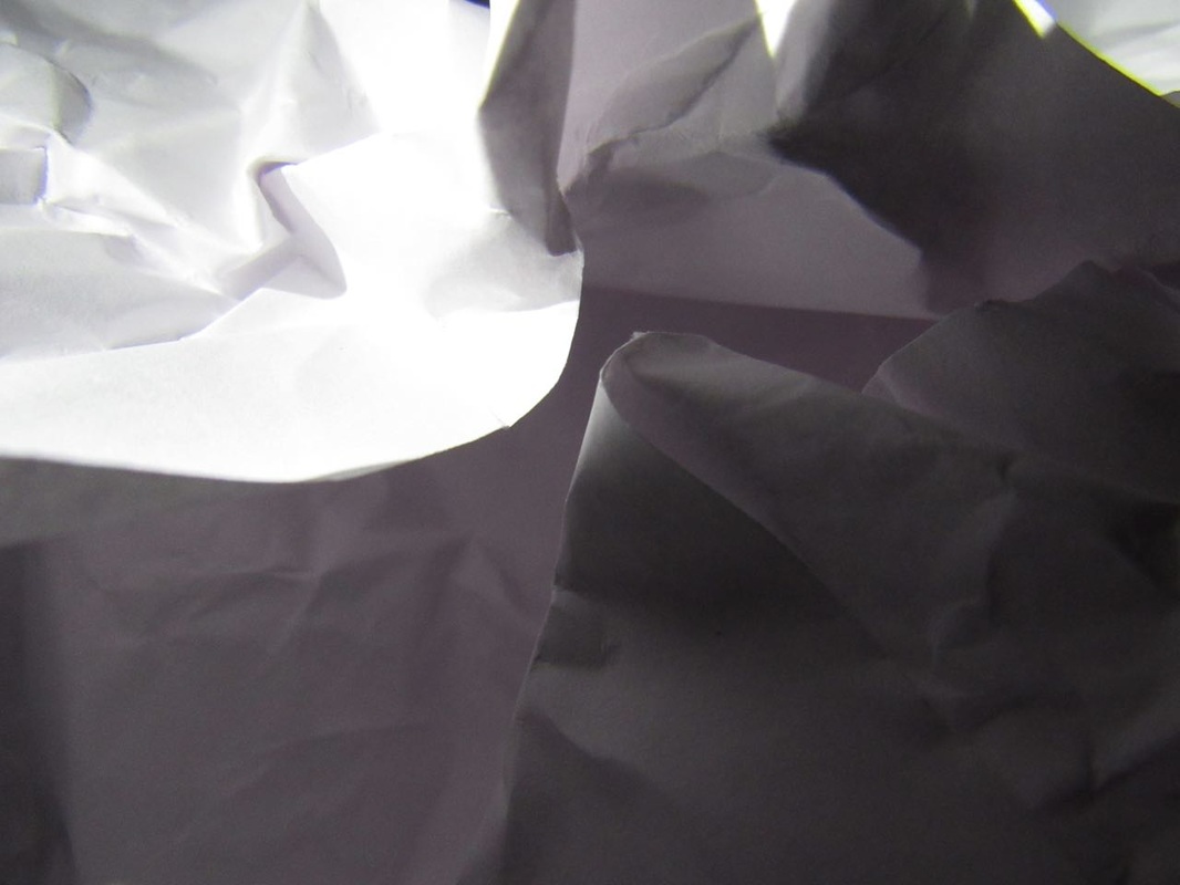
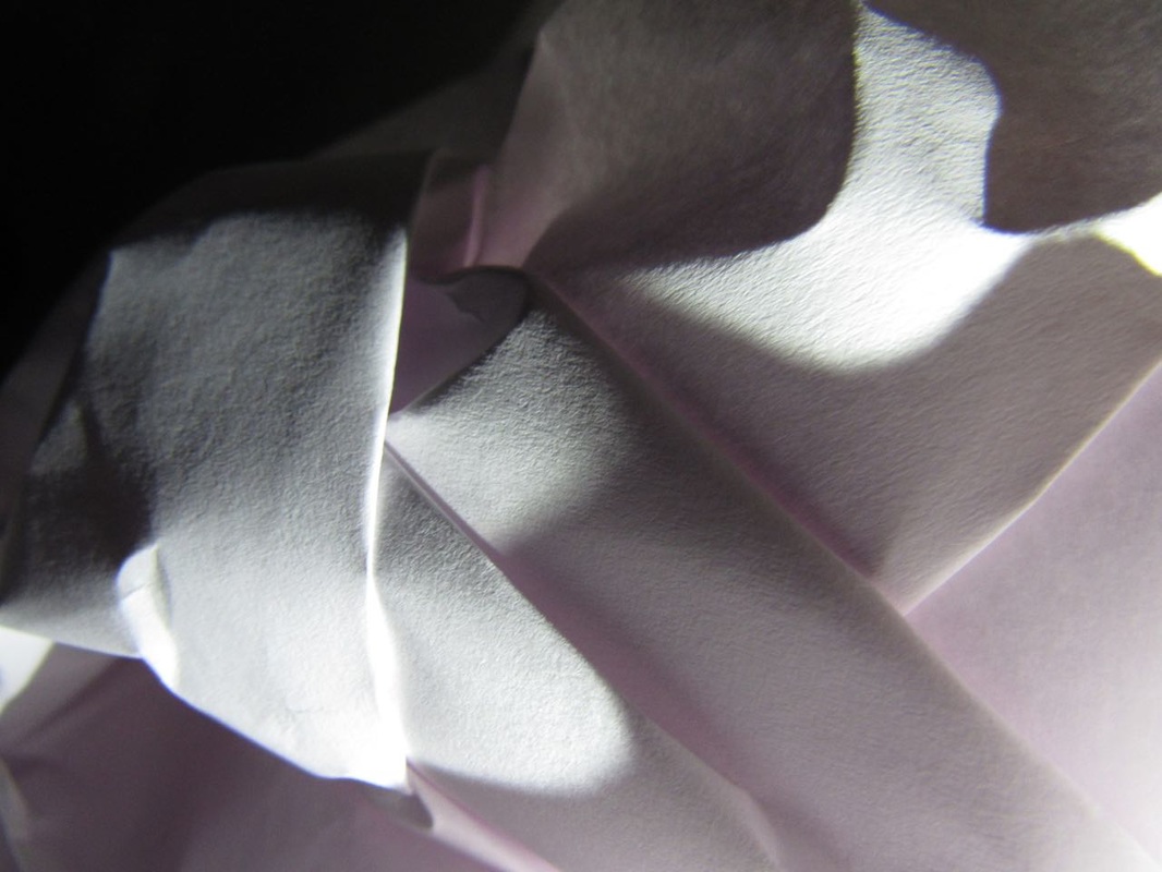
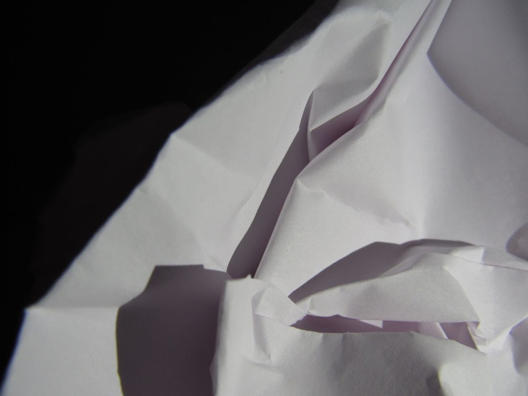
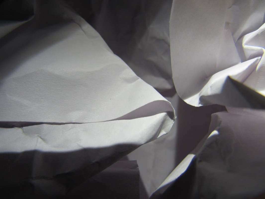
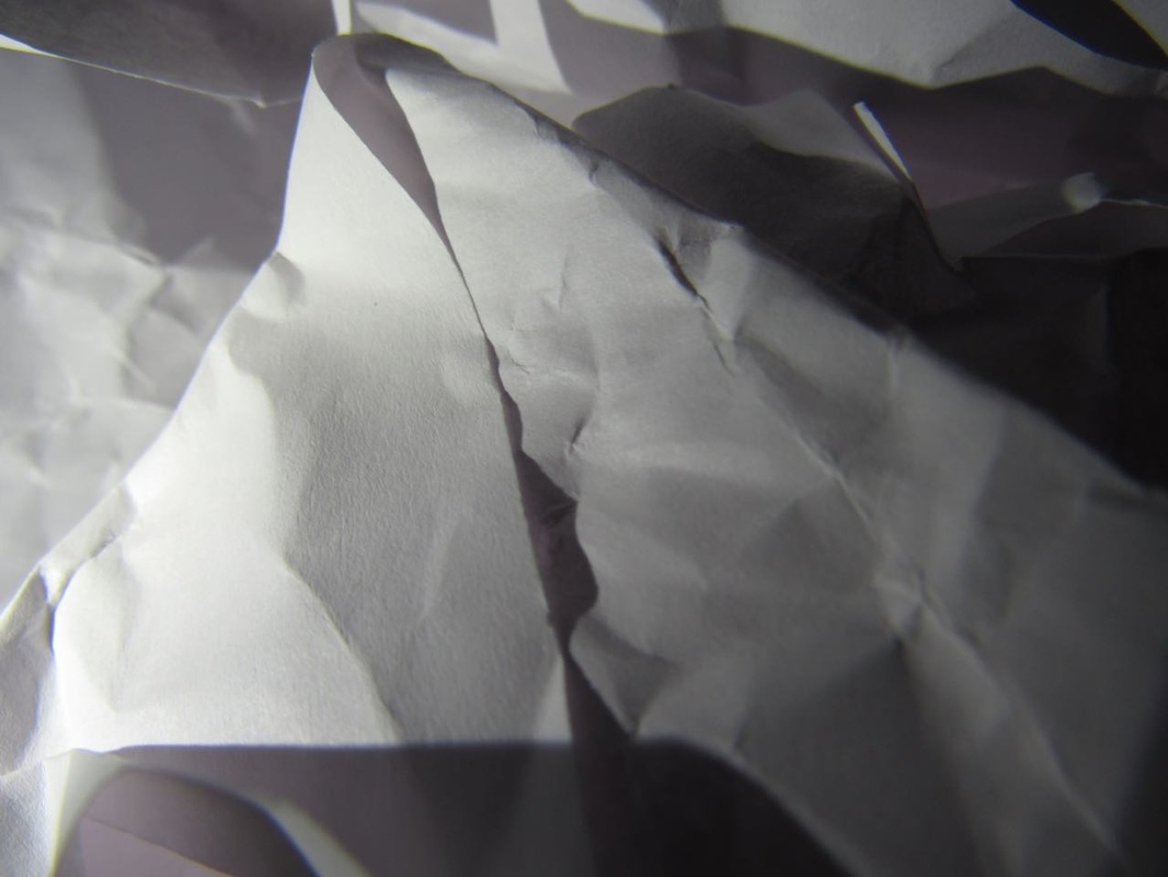
Paper Photoshoots
To achieve these photographs, we folded up pieces of paper and shone a torch on them , so that the shadows created contrast.
This effect made some of the pictures look like they weren't paper at first glance.
WWW: I like the top three, because I feel like they are the most abstract.
EBI: The bottom three could have looked better because those ones loooked too much like paper and didnt make you think about what they actually were.

|
|
|
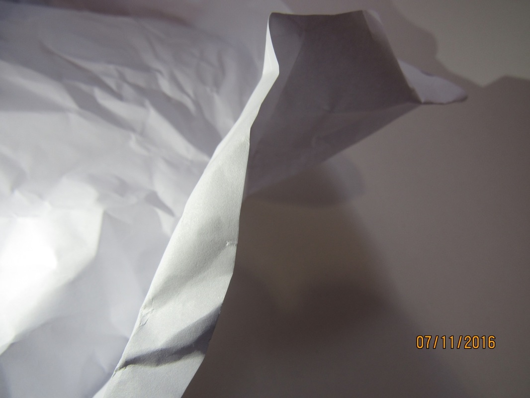
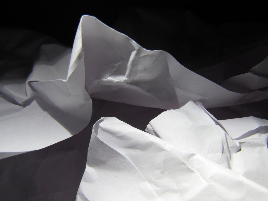
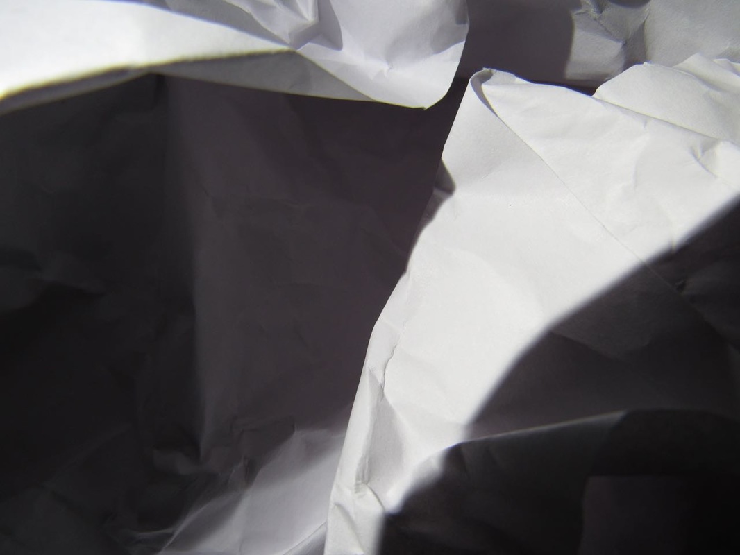
This is my favourite photo, because I like the contrast between the shadows and the highlights. I think that it looks the least like paper. It is more abstract than the rest, which is the point of this task. The subject by the end should be, in a way, unrecognisable.
|
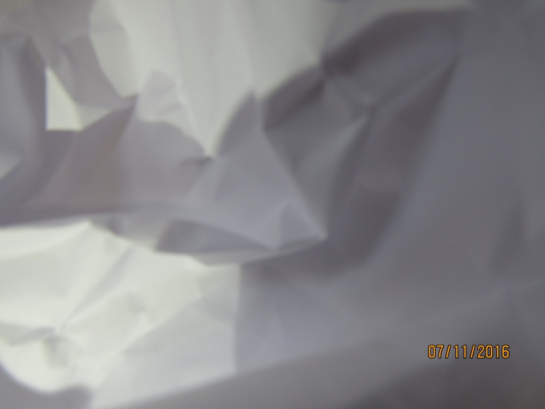
This is my least favourite. This is because the fact that you can see the paper that we used as a background. I think this ruins the effect. I also don't like the fact that it is too light. There aren't enough shadows. And the paper isn't the main thing in focus.
|
Second Paper Photoshoot
For this photoshoot, we did pretty much the exact same thing a we did in the first, however this time we went into the dark room so that there were more shadows, which made a bigger contrast.
|

|


|
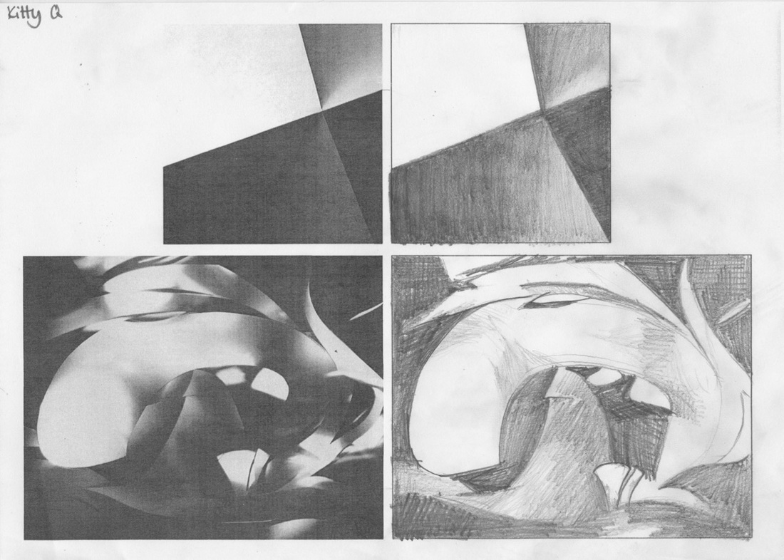
Drawing
For this task, we were given two photos and had to try and recreate them on paper. I quite enjoyed drawing the first picture, as it was fairly simple and easy to follow. I did not enjoy drawing the second photo as much, as it was not as clear and straightfoward.
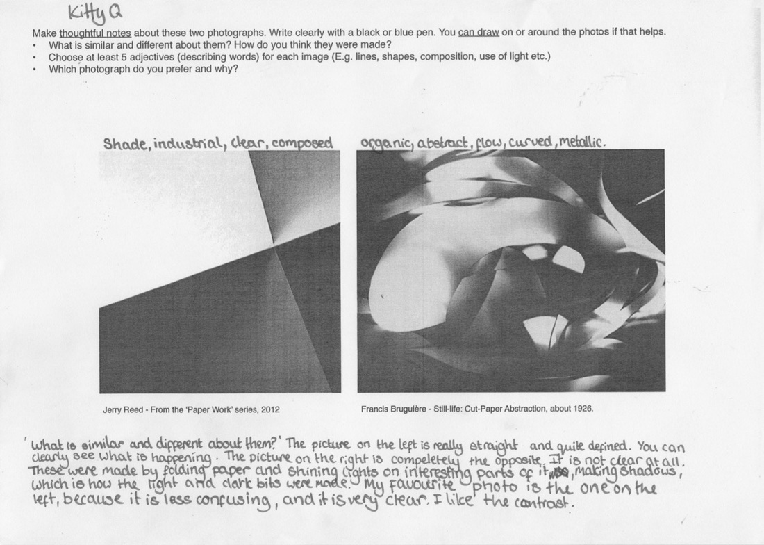
Notes
We were also given this sheet, upon which we had to complete the tasks on the sheet.
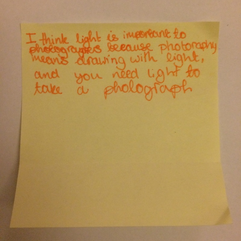
Why is light important?
This is why I think light is important to photography:
Light is important to photography because photography means drawing with light. Without light, you would not be able to take a photograph because you need light.
But not only is light important to the process, it is crucial to the actual photograph itself. The way light shines, the direction of the light help to shape the photo, Different lighting changes the perspective, the mood, the tone of the image.
collages
Throughout the past weeks, we have also been making collages out of old photos and our own paper abstraction photos. For my collage, I decided to cut my photographs into little strips and arrange them in different orders.
WWW: I think this turned out well, I liked how distorted it looked.
EBI: I think it could of been better if I had maybe used a different colour photo for the strips like a green photo.
WWW: I think this turned out well, I liked how distorted it looked.
EBI: I think it could of been better if I had maybe used a different colour photo for the strips like a green photo.
Stop motion collage from Thomas Tallis School on Vimeo.

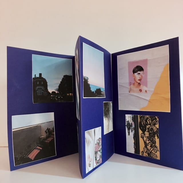
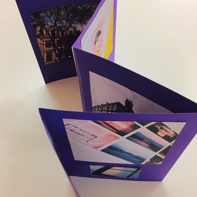
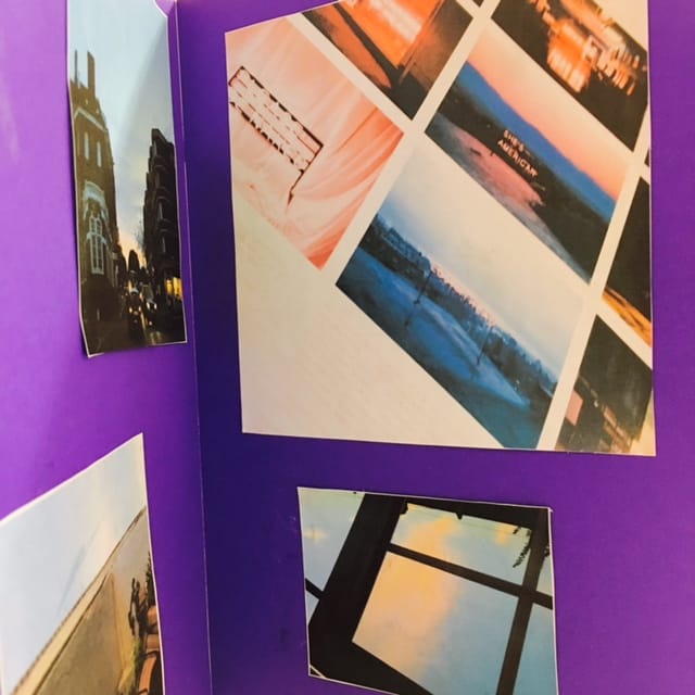
concertina books
For our half term homework, we were asked to make concertina books containing our edges photos. I found this homework very fun as I enjoyed making a physical representation of my work. If I could redo it, I would make all the photos the same size and make the actual book smaller.
|
|
Photoshop
Today we had a go at using photoshop.
comparison essay
We wrote essays comparing Robert Franks "sick of goodbys" and Lorenzo Vitturis "Red #3". I was given some sheets to help me with this.
The first picture, sick of goodbys, looks like its composed of two sections. The top section is of what looks like a mirror with the words " sick of" graffitied onto it in drippy writing, like the artist painted it on with really runny paint. From the left hand side, you can see an arm protruding from out of the frame. The hand is holding a small, skeletal toy. On the right hand side there is a smudge, which could have been painted on or maybe happened accidentally. The bottom section is from a side perspective, everything in the photograph is tilted. There is a large central mirror with the word "goodbys" written on it, again in the same dripping paint. Propped up against that mirror is a second smaller mirror. The photograph is taken at such an angle that the reflection in the mirror is unable to be seen. However in the bigger mirror you can faintly make out the reflection in it. It looks like a vast expanse of an ocean , therefore the picture must have been taken from quite high up, on a hill maybe as you can also see some land and a telephone pole. on the right is a fence made up of panels of wood painted white. There is a triangular shaped shadow on the fence. This is a landscape photograph.
The second photograph, Red #3, has 3 sections. In the bottom section, the background is a surface that is a creamy colour. In the left hand corner is a metallic disk which could be a badge or a coin maybe. Placed on top of that is a paint palette with red paint. in the middle of the mid ground is I can see a brick covered in either spaghetti or string. There are also some red berries scattered around. Behind the brick is an ashtray with some ash and a couple of cigarette butts. The next layer consists of a baby blue background. On top of the brick is a weird basket thing, the top half painted red with what looks like intestines made of clay spewing out. There is a red ball sticking out of the basket on the left and a red flower on the right hand side. On top of the basket of intestines is a ball that is half brown with textured dots. next to that is a green plant. on top of the ball is a blue cup that has been turned upside down. on the other side of the ball is a red flower and some red balls.Next to that is what looks like some bark, with the same textured dots as can be seen on the bottom half of the aforementioned ball. Then there are some plastic looking red peppers balancing precariously on top of the bark. The third layer has an orange brick background . Balanced on the peppers is a coconut that has the top shaved off, exposing the inside of the coconut. This picture has really bold colours, whereas the previous photo is in black and white. The contrasting background draws attention to the middle of the photograph.. I think this picture is a still life photograph.
The main similarities between these two photographs are that they are both abstract, they can be interpreted differently, they both have different sections to them, and they both contain lots of edges. The main differences are that one of them is in black and white and the other is full of bright bold colours, one has writing on it the other doesn't ,they have different themes, and they contain completely different objects. In the first photo I don't feel like there is very much negative space, everything feels quite close together. I think this is because there is a lot of things going on in this photograph and also the fact that its in black and white and that everything feels very on the surface of the photo, and that there is no background or mid ground, there is only foreground. In the second photograph, its very different. This photo feels a lot clearer, less claustrophobic. It doesn't feel like everything is bunched together because you can see the back ground and you can tell where everything is supposed to be, and most of your attention is immediately drawn to the middle of the photo. The part of "sick of goodbys" that strikes me as most interesting is the little skeleton doll. It confuses me and i don't know why its there or what it really has to do with the photo, but on the other hand i really like it, it gives the photo an air of mystery and horror. My favourite part of red #3 is probably the whole of the odd structure in the middle. I don't know what it is but i like the colours and the contrast between the bright red and the toned down bluse and oranges and creams of the background.
In these photographs there are a lot of edges, whereas in real life there wouldn't have been. This is because when you take a photograph, the objects that have been captured get flattened, giving the illusion of edges.All photographs contain edges, because photographs create the edges. In the first photograph I can see the edge of the smaller mirror, the edge of the fence, the edge of the bigger mirror, the edge of the arm and the toy and the horizon of the sea in the reflection in the top mirror. In the second photograph,I can see the edge of the cup, the edge of the brick ,the edge of the table, the edge of the flower and the ashtray. If I could talk the the photographers who took these photos, I would ask them Why they made these photos in the way that they have, and What inspired Robert Frank to make a photo with such a deep title and message, and why did Lorenzo Vitturi create such an odd sculpture, is there a meaning behind it?
I would call " sick of goodbys" "Mirrors" because there is a lot of mirrors used in this photo, but also because its mirroring how Robert Frank was feeling. I would rename "red #3" "Miscellaneous" because its a load of miscellaneous objects put together to create something. If i was inside " sick of goodbys" I think the atmosphere would be dark and confusing. The weather would be rainy and cold and grey skies all around. On the other hand i fell as though being inside Lorenzo Vitturis photograph would be like living inside the teletubby world, all bright and colourful and entirely random. I think Robert Frank made this photo because he was annoyed at someone, maybe at everyone. He was telling people how he felt and what better way to get his feelings across than making them into art. "Red #3" was made,in my opinion, for fun. I think that Lorenzo Vitturi liked the concept of taking anything and mashing it together to make a really cool structure. Robert Franks photograph was about problems. He had a problem and he wanted to make it known, or maybe create something that people could relate to. Lorenzo Vitturis photograph is about ideas. I think this because i dont really think he had a meaning to it and he just did what he want and therefor this photo is open to interpretation. You could analyse this photograph as much as you wanted to but in the end I don't think that any of your ideas would be what he was truly thinking.
photoshoot
mind maps
edges assesment
For our edges assessment, we had to take photographs of photographs. This concept came from the work of a photographer named Jiro Takumatsu. He made a project all about taking photos of photos and thats where I got some of my inspiration.I liked the concept of this because by taking photos f photos, we are therefore creating more edges.
Here are the instructions we were given:
1. Select one or two photographs from the pile
2. Select a camera
3. Re-photograph your chosen photographs in a variety of different locations at least 5 times
4. Think carefully about the edges in the photographs, the edges of the photographs and how they relate to each location
5. Be imaginative. Try to re-imagine the photographs each time you re-photograph them.
WWW: I think that I put the images in cool and interesting locations and created more edges out of them. I like how they turned out.
EBI: If I had taken slightly less photos (I took 120, we were meant to take 5) and also if there was better lighting inside , maybe if it was darker and if the light was less yellow.
I have selected 54 photographs that I liked.
School photo shoot
We were given the chance to expand on our edges projects and take some more photos. I decided that I wanted to focus on objects around the school.
Evaluation
WWW: I like how clean these photos look. They don't feel cluttered, and I think all the colours go quite well together.
EBI: If I had taken more photos, and maybe some more of people. Also if I had done something cool with them such as cutting them out and editing them.
Evaluation
WWW: I like how clean these photos look. They don't feel cluttered, and I think all the colours go quite well together.
EBI: If I had taken more photos, and maybe some more of people. Also if I had done something cool with them such as cutting them out and editing them.
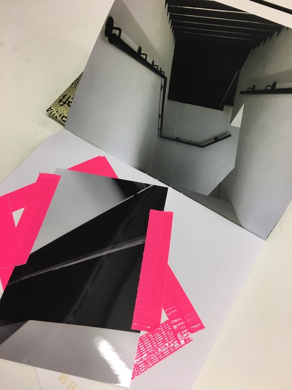
#tateexposed photofanzines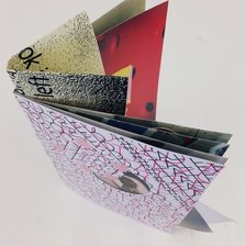
We were given lots of interesting photographs and bits of paper and stickers and tape and 14 minutes to make our photo fanzines. This task was challenging and i found it very fun and exciting and I like the outcome.
WWW: we didn't have a lot of time and so I think I did well considering. EBI; I think these would have been better if i'd have had a bit more time and also I should have been more creative. I spent more time on certain things than I should have. |
|
my final outcome
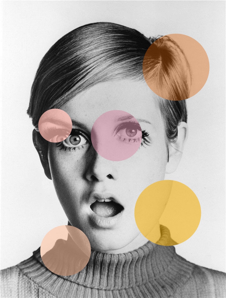
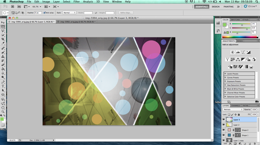
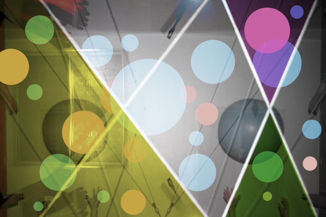
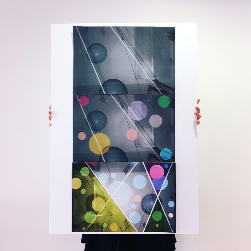
For my first final outcome I decided to take two images of people throwing a ball taken at different points in time, and merge them together in photoshop so that you could almost see the ball flying through the air. I decided to do it like this because I wanted to make it like a stop-motion film. I think that my final outcome is effective because I have achieved the feel that I was striving to achieve. I enjoyed making this because it was fun to create and fairly easy because I just had to merge the photos and change their opacity, but it still looks cool. I am pleased with my outcome because it is playful and colourful and I used my intuition and tolerated uncertainty. To make my final outcome, I used a camera and photo shop. In photoshop I added the two photos together and changed the opacity. On the second part I cut out some circles and changed their colour. On the third part I changed the colour of some other parts.
|
|