Use of colour
The Choice Of Colour
I chose this starting point because to me, colour is one of the most important factors of what makes a photograph.
- I want to find out how photographers view colour as a factor in taking a photograph.
- I want to know what goes into the choice of colour. Why its so important. How it came to be so popular in our everyday lives.
- How does the colour in a photograph help convey meaning and emotion?


Daroo Photography, Jacob Reischel and Matt Russell produce still life photographs where choices about colour strength and contrast are very important. Martin Parr and Alec Soth carefully consider the colour of props, clothing and background in their documentary studies of people and places.
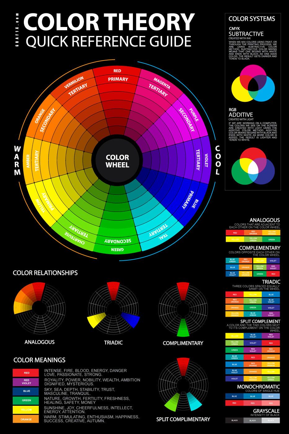
Colour Theory
I study art as well, and I want to explore the different ways that colour works optically in each subject. In photography colour is subtractive; all the colours together make white. In art, colour is additive; all the colours together make a muddy brown/black.
The additive colour system is the concept that you start with a dark, lightless palette, and light is added to create the colour.
The subtractive system, in contrast, is where you start with white, such as a piece of paper, which reflects all the colours on the visible light spectrum . The colours are then subtracted. Subtracting all three of the primary colours produces black. This process is used in printing.
My understanding of colour theory
|
The colour theory is the theory in art that different colours affect the way that other colours look. In photography, photographers have to think about colour first and foremost, and the many different was it can effect a photograph, in the ways that colours have relationships with one another and how this can add something to a photograph. To choose colour means that the colour in the photograph is a main focus. It wouldn't work in black and white, because then it would be lacking the main element, the thing that caught the photographers attention in the first place.
Different colours signify different emotions. Red is passion and lust, but also death and blood. Blue is universally calming; the sound of lping waves on a moonlit ocean. Green is jealousy, but it also shows power, and nature. Yellow is bright happy sunshine. It signifys joy. |
Threshold Concepts


I think that this theme relates most to these threshold concepts.
#7: Photographs are not fixed in meaning; context is everything. I think that this relates because one way to add and change the meaning is through adding colour. Context in a photograph is about where it was taken, the thoughts of the photographer, but at the same time, it also depends on the viewers feelings and emotions, and their current thoughts. The meaning changes as it is passed from person to person, because the way we interpret things is based on our outlooks, behaviours and responses. Colour conveys emotions, but these emotions change the in the same way, from person to person, depending on your current outlook.
#4: Photography is an art of selection rather than invention. This concept applies to my theme because a photograph is merely a glimpse into the mind of the photographer,and what they find appealing or sometimes unappealing. Unlike in art, photography is a reflection, a highly accurate depiction of everyday life. It relies on the surroundings, and the colours they contain. A photographer has to choose carefully about what they leave in the fame, or exclude, and colour is very important in deciding this.
William Eggleston
Up until quite recently, to photograph in colour was considered out of the ordinary. It was commonly linked with advertisement, and many photographers preferred to shoot in black and white to keep the authenticity. To choose colour was to associate yourself with commerce, and if you considered yourself a serious artist, you wouldn't go anywhere near colour. William Eggelston was the first person to have a colour photography exhibition, and he's considered " the master of colour". It was due to him that colour photography first integrated into society. He did this by experimenting with colour for years, and presenting colour photos that were so different to the norm of previous colour photography, that he destroyed the link between colour photography and advertising.


William Eggleston takes inspiration from a photographer that I have looked at previously; Henri Cartier-Bresson, who made the book "the decisive moment" . I find this interesting because his photos remind me more of the photos from "indecisive momento" by Nick Wapplington, which is a critical response to the aforementioned book. I think his photos are beautiful, and the use of colour works with these photos extremely well, because if these were in black and white, the audience would be missing out on something vital. Colour is a choice because it adds something necessary to certain photos. For example, if a photo was depicting something that was mostly tonal colours, it would be better to shoot in black and white because it would show deeper, darker tones and would give the photograph something extra, it would add to the main subject because it would emphasise the texture. Whereas if I were to shoot in colour, it would be purposeful.
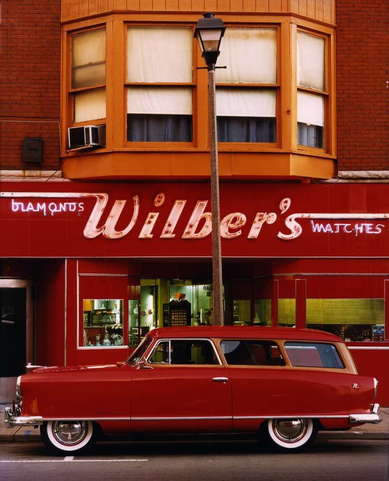
This photograph by William Eggleston is an example of where analogous colors have been used to alleviate the appearance of the subject; red and orange and a small splash of yellow. These colours work together, the orange brings out the red more and looks less vibrant in contrast.If this was shot in black and white, the photo would be missing an integral factor. The photograph would lose all meaning, it would be reduced to just a plain store front. `The photographers actions and reasons behind the photo would be erased. To choose colour is to bring the photo to life. However, Black and white photographs can also add texture, and tone that may not be conveyed in colour.
William Eggleston's Photographs are appealing to me due to the visually pleasing tones and hues that embody his work. His colours are all put together and purposeful, they are strong without being overly saturated. His photos are sharp and crisp and the almost unnaturally bright colours create a sense of the uncanny, and portray a surreal, utopian image.
William Eggleston's Photographs are appealing to me due to the visually pleasing tones and hues that embody his work. His colours are all put together and purposeful, they are strong without being overly saturated. His photos are sharp and crisp and the almost unnaturally bright colours create a sense of the uncanny, and portray a surreal, utopian image.
Jacob | Reischel
Jacob | Reischel is the brand name of two photographers, Marie Jacob and Julia Strathmann (Reischel). They make still lifes that are used in advertising and production. Im interested in them because their work contradicts the first thoughts about colour photography that have looked at. Their work is used for advertising in the way that the early colour photographers tried to move away from.
Alec Soth
Alec Soth is an American photographer who has several books and creates "large scale projects". His project entitled "I know how furiously your heart is beating" captures images where the foreground is sometimes blurred, drawing attention to the objects and people in the background.
|
|
|
Alec Soth's Photos contain an old fashioned elegance to them. They use colour everywhere, and provide a unique abstraction and surreal feeling to them, a thought that fascinates me. In the first photo in the slideshow, it shows a purple wall and a bookcase. Which is a very ordinary scene. However, the way in which Soth has taken it uses the connotations of purple to his advantage. The lilac colour conveys a mysterious tone, and the effect of the books in the bookcase being practically the only thing in the photo that isnt purple draws attention to them, creating an atmosphere of ambiguity.


I went on to try and take some photos that provide the same ambiguous tone, and I found that some of the subjects of these photos provide this sense, particularly the bottom three.
My First Photoshoot


Most of my life is spent on buses, and they provide a window into my small world from a perspective that is usually unavailable . These are some photos I took recently on my way to and from school. One thing I dislike about these photographs is the lack of crisp contrasting colours. I think that the colours are too faint and there isn't much solidity to them.
However there are two that I do like. I like these two because they both have a diagonal leading line. Also I like how they are both though the windows, which frames the main subject, but they are both from different perspectives in the sense that one of them is through the window from the inside of the bus and the second one is from the outside in. I think that the window provides an interesting distortion in the second photo, where the heads and peoples bodies are spliced.
However there are two that I do like. I like these two because they both have a diagonal leading line. Also I like how they are both though the windows, which frames the main subject, but they are both from different perspectives in the sense that one of them is through the window from the inside of the bus and the second one is from the outside in. I think that the window provides an interesting distortion in the second photo, where the heads and peoples bodies are spliced.


Saul Leiter
Saul Leiter was an early colour photographer in the 40' , 50's and 60's. He started shooting colour photography in the 1940's, and shortly afterwards his work was noticed by Edward Steichen, and displayed in two important MoMA shows. His work was featured in an exhibition called "Experimental Photography In Colour". One of the main resons that his photography didnt have the same impact as William Egglestons work is due to the fact that after this exhibit, his color photos were mainly never printed and he became better known for his work as a fashion photographer. It wasn't untill the 1990s that his early unseen colour photos were printed.


|
Saul Leiter is really good at capturing the complimentary colours, and really focusing in on making one colour brighter than the rest. He shot most of his images using kodachrome slides, which had really deep, saturated reds. His images often seem to be dark, apart from one splash of colour. They are sometimes unclear, blurry and focus more on showing the world than understanding it. Saul Leiter was also a painter, and was friends with many abstract expressionists. His work soemtimes mimics these peices, in a sense you can almost see the paintings in the images and vice versa. Abstract expressionism was about expressin emotions through painting. While they dont particlarly have a clear messsage, the effect of them is bold and powerful.
|
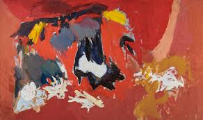
This image by Ethel Schwabacher particularly reminds me of a saul leiter image, i think due to the deep red tones sourrounding the darker colours.
|
Paul Gaugin
|
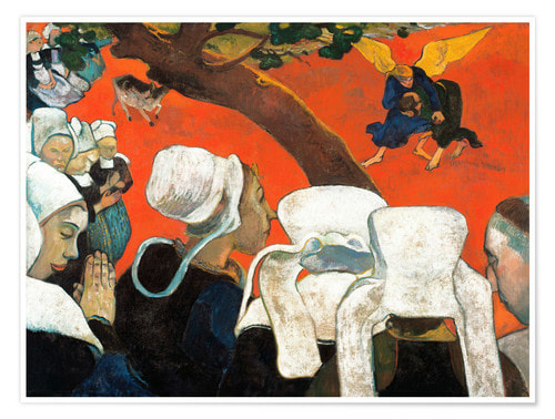
Paul Gaugin's painting, Vision After The Sermon, is an early example of colour in painting being used unaturalistically. This image depicts a vision that church goers in France had, after a sermon about Jacob wrestling the Angel. The grass upon which they are wrestling on is shown to be an orange/redish colour, and helps communicate the idea of it being surreal, a vision instead of reality. This painting was used as inspiration for Fauvism, a later art movement which moved away from previous ideas about art, such as realism and representation.
|
|
Based on this idea of changing the colour of a real object to something different in order to change the meaning, I decided to try and add colour and change the mood of an image I'd previously taken.
|
|
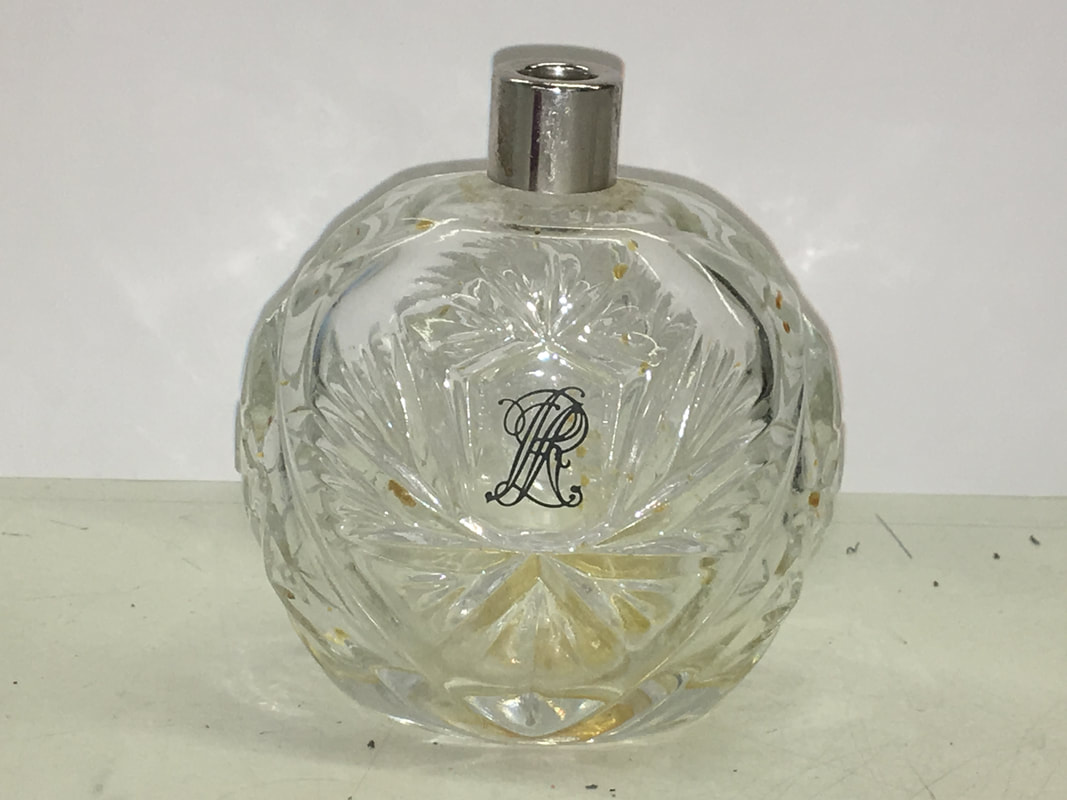
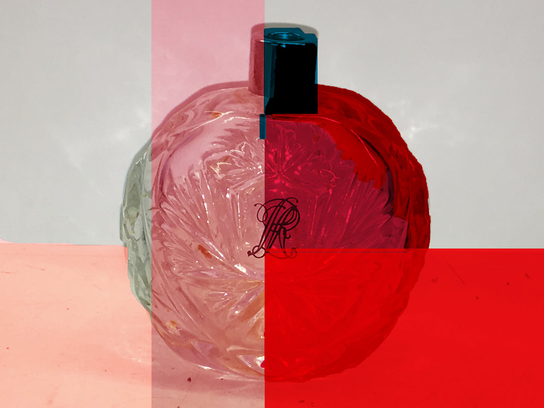
I used this idea of adding colour to a photograph and created this ,using photoshop. I decided to use pink and red to relate the photos to the purpose of the object. A perfume bottle ordinarily has connotations of beauty and grace, they belong to women who are strong and powerful and grand, and in my personal opinion, pink is a colour that embodies this, and red is a harmonious colour with pink, I chose it mainly as an experiment, because sometimes pink and red works and at other points it doesn't. I enjoyed being able to dictate what colours i wanted to use. This, to me is very important because it allows me to really explore this theme, and think about the reasons for the choice of colour.
Ruth Van Beek
Ruth Van Beek is a photographer who uses found photos and abstracts them with paper. She covers up the subject until its unrecognisable, with only a little bit of it showing. This concept is unusual because instead of photographing in the usual way, with a subject that the photographer happens upon by chance, she uses found photos. This is the art of selection in a more abstract way, and then by adding colour through cut outs is similar to Paul Gaugin's use of colour and the way I experimented using photoshop. I decided to develop this prior idea a bit more and so I took the original photograph of the perfume bottle and applied this concept to it. I am happy with the outcomes, because they fulfil this concept, but in a different way to how Ruth Van Beek does it, in the sense that instead of using a silhouette of the object I was abstracting, I used shapes of different proportions and and colours.
My Take On Ruth Van Beek's work |
Ruth Van Beek's work |


More photos


I think this second set of photos demonstrate the more opaque take on colour that I'm looking for, however they also have a darkness to them, instead of the intense, vibrant colours of Eggleston's work.
Matt Russel
Matt Russel's work has a similar purpose to the works of Jacob|Reischel. They all photograph for the purpose of advertisement, in the way that colour photographers in the mid to late 20th century tried to move away from. Matt Russel is a "food stylist" and his photographs are featured on several magazines and websites, including 'the Guardian' and 'the Independent'. His work is bright and saturated, and focuses on appealing to the audience. They are visually and aesthetically pleasing, as all the colours of each dish are arranged in a way that is pleasing to the eye, according to the colour wheel.


Graffiti
These are some photos of graffiti around a certain area. These photos depict bright flashes of colour that catch your attention. I think that graffiti is an exciting concept because most of it is personal. By this I mean that the photos I took all contain peoples personal tags, names and images they use to identify themselves. This use of bright colours draws reflection, in a way, to the people themselves because although they are, to some extent, anonymous, you still grasp a sense of who they are.


Daroo photography
Daroo photography is a style of photography used particularly in advertising. It is highly saturated, and often used when advertising brands of pencils, because the vibrant hues help to show off the colour range. I dislike this type of photography mainly because I think the extreme focus on colour and nothing else is too aggressive, and I dislike over saturation and the dark undertones. However it is effective imagery for brands such as 'Bic' and 'Crayola'.


Photos From My Camera


The science of colour


There is a science behind why flowers are bright colours, why fruits and animals are so vibrant. Flowers need to be pollinated; they need to attract bees. Plants need animals to eat their fruits, in order to spread the seeds and be reborn. Animals, normally males need to attract a female mate in order to reproduce. All things in nature use bright colours to attract the certain things. It's a science, one that is replicated today in the way our brain immediately draws attention to the most striking colours in a photo.
This is an interesting concept, as I think it partially explains why we choose colour. The choice of colour is something that helps photographers to attract an audience, to pay attention to the smaller details in life. Things that are often missed, things we take advantage of. Colour adds life, it adds emotion.
This is an interesting concept, as I think it partially explains why we choose colour. The choice of colour is something that helps photographers to attract an audience, to pay attention to the smaller details in life. Things that are often missed, things we take advantage of. Colour adds life, it adds emotion.


These are a few photos that I took whilst out in Blackheath. I think they conform particularly well to the pre established ideas about colour photography I have come across based off of artists I have researched, mainly because this was a sunny day and consequently the appearance of the sun changed the natural lighting and i was able to take pictures which didn't reflect the grey skies of ordinary London
School Photos


These are a few photos that I took whilst in school on my camera. I like the arrangement of the three images, as they decrease in light gradually, and the contrast of the complimentary colours, blue and orange, is striking.
Keld Helmer-Peterson's 122 Photographs


Keld Helmer-Peterson spent most of his life photographing architecture, and this was one of the main reasons that his work in colour photography was considered less impactful than the work of others such as Eggleston. However, although his work didn’t bring about new attitudes in response to colour photography, he is still considered a pioneer of colour photography. His book, ‘122 colour Photographs’ aims to purely make photos that can only be viewed in a way that completes the image using colour. His work is a very early example of the necessity of cour, the use of colour to your advantage, to add something to the image.
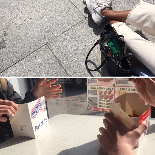
I created a response to Helmer-Peterson using the form of diptychs to present my work.
However I don't think these photos purely reflect his work. They don't require colour, it isn't the main factor in the vital way that colour is to Helmer-Petersons work. These dont acheive the purpose of his work. However I do like the composition of the photos, especially the first one, as the small splash of green contrasts with the strong blacks of the bag and the shadows, and also the bright white.
However I don't think these photos purely reflect his work. They don't require colour, it isn't the main factor in the vital way that colour is to Helmer-Petersons work. These dont acheive the purpose of his work. However I do like the composition of the photos, especially the first one, as the small splash of green contrasts with the strong blacks of the bag and the shadows, and also the bright white.
Photos In Lee


Martin Parr
Martin Parr is a British photographer who focuses on pointing out the things in life, in society, that are a little bit "weird" and "out of the ordinary" and to do this he uses colour as a prop to draw the audience in. The use of colour in his photos helps him point out what he's focusing on and what he wants too point out that demonstrates his point about his subject. I went to visit his exhibition at the national portrait gallery, entitled "Only Human". It is an exhibition which depicts a sense of British pride, and ordinary British idiosyncrasy.


|
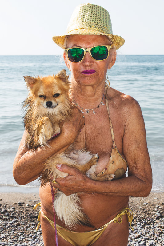
This photo by Martin Parr is a great example of his use of colour to establish a point about the subject to the audience.
This woman in this photo is quite old, but her clothes and the way she presents her self tells the audience that she feels a different way. She's at the beach, wearing a gold fedora, a fairly skimpy bikini, flashy gold sunglasses and a vibrant purple lipstick. She stands out and she seems proud of this, and Martin Parr photographing her is a way for her to show off. The use of Emerald green and purple are a bright contrast with the beige and brown of the woman and her dog. Many people have criticised Martin Parr for his way of making photos, saying that they give off the sense that he's looking down on the people whom he photographs, and others see this as a playful way to engage the audience. I tend to agree with the latter His photos are brave documentaries of the extraordinary we encounter every day, the things we often miss. |
Photo Book Plan
My first plan for the two day exam is to make a photo book by hand. I want to make a bound book and will do plenty of research and i will document it all on here, including a documentation of my first attempt which i will do at home.
If I fail to create a successful book, then i will purchase one, however i would prefer to have a handmade one.
The reason I would love to create a book is because by making a book you not only get the opportunity to curate the work inside, you can use what ever paper you please, any size, shape or colour. I have settled on the idea of a book as a final outcome, as it is simple and effective, and it means i can really tell a story, and use words and messages to bring ideas about my photos to the readers brains.
I have been inspired by Martin Parr's recent book, "Only Human", and Keld Helmer-Peterson's "122 Photographs" as I think they are beautifully arranged and portray their use of intense colour in a way that is subtle and works well.
Photo Book Research
I started trying to find out the best ways that I could make an effective photobook from scratch. I watched some videos on youtube explaining some ways in which I could do this, and discovered several.
The first one I tried was hand stapling. For this, I took a piece of blue card and a few pieces of paper and folded the all in half. I then placed the blue card at the back of the pile, and white paper on top and marked out the length of one staple at each end of the paper, about 3cm from the end. Next I poke holes for the staple to go through at each end of the stapler marks and put the staple through each hole. I then folded over the ends of the staple, to close it. I repeated this on the other side.
I found this way of book making easy and quick however not as effective as I would have preferred. I think this was partially because the book didn't close fully, and I wasn't satisfied with the overall aesthetic of it.


Just to try another way of creating a photo book, I decided to try to sew one. However, the sewing machine broke and hand sewing through card proved to be especially challenging and so instead I tied some string around the middle and hoped for the best. Regardless to stay, the pages didn't stay together and kept coming apart from the cover.
However, I preferred the way this book looked, as the white string was, in my opinion, a nice addition.


Plan B For My Exam
Instead of creating my own book from scratch, i decided instead to use one of my old journals. The reasoning behind this is that the pages of my notebooks contain thought, notes, phrases, that are filled with colour. My idea is to use each of these pages, and coloured paper to obscure the "subjects" in a similar way to Ruth Van Beek's style; found photos in this case being my old notepads that i have no use for and recycling them. Recycling my old thoughts and use of colour and making something new out of it. The random words can serve as titles, for the audience to create links in their minds with the photos I put with them. The colours of the pages combined with the colour of the paper I use can be complimentary to the main colours of the photos I place with each.


