Introduction
|
This term I will be exploring the theme of abstraction. The word abstract means “ relating to or denoting art that doesn’t attempt to represent external reality, but rather to achieve its effect using shapes, colours or textures” . In a way, all art is abstract, because it’s a copy of reality. We focused on the idea that some artists use the formal elements to make a photos abstract, by emphasising one of the elements. For example, they could use the formal element focusing and purposefully defocus the image. Some examples of artists that experiment with abstraction are Ola Kolehmainen, a Finnish photographer and Harry Callahan >>>>>
"Abstract art has helped us to experience the emotional power inherent in pure form." - |
|
The Formal Elements
The formal elements are a list of components that help make up a picture and define the difference between a good photograph and a bad photograph.
Focus:Which areas appear clearest or sharpest in the photograph? Which do not?
Light:Which areas of the photograph are brightest? Are there any shadows? Does the photograph allow you to guess the time of day? Is the light natural or artificial? Harsh or soft? Reflected or direct?
Line:Are there objects in the photograph that act as lines? Are they straight, curvy, thin, thick? Do the lines create direction in the photograph? Do they outline? Do the lines show movement or energy?
Repetition:Are there any objects, shapes or lines which repeat and create a pattern?
Shape:Do you see geometric (straight edged) or organic (curvy) shapes? Which are they?
Space:is there depth to the photograph or does it seem shallow? What creates this appearance? Are there important negative (empty) spaces in addition to positive (solid) spaces? Is there depth created by spatial illusions i.e. perspective?
Texture:If you could touch the surface of the photograph how would it feel? How do the objects in the picture look like they would feel?
Value/tone: Is there a range of tones from dark to light? Where is the darkest value? Where is the lightest?
|
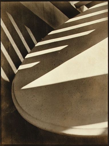
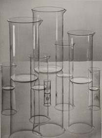
This photograph is called Abstraction, twin lakes, Connecticut by Paul Strand.I think the photographer was interested in:
One interesting thing about this photograph is that although it becomes increasingly obvious after a while, at first you cant tell what it is, which seems strange as it is actually an ordinary table. This affect is caused by the use of shadows and contrast and also the fact that this photograph is turned on its side, which alters the perspective.
The best thing about this photograph is the of different shapes caused by the lighting and shadows. The formal elements used in this are light, repetition with the shadows, space and line. He focuses on the shadows and repetition drawing attention to the different shapes the shadows make. This photograph was the first photograph with the word abstraction in the title. |
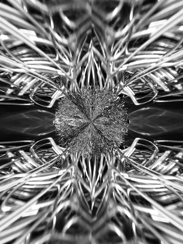
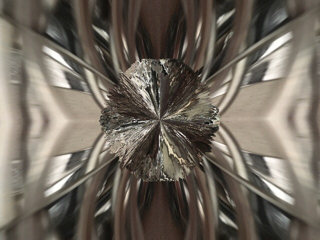
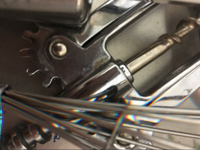
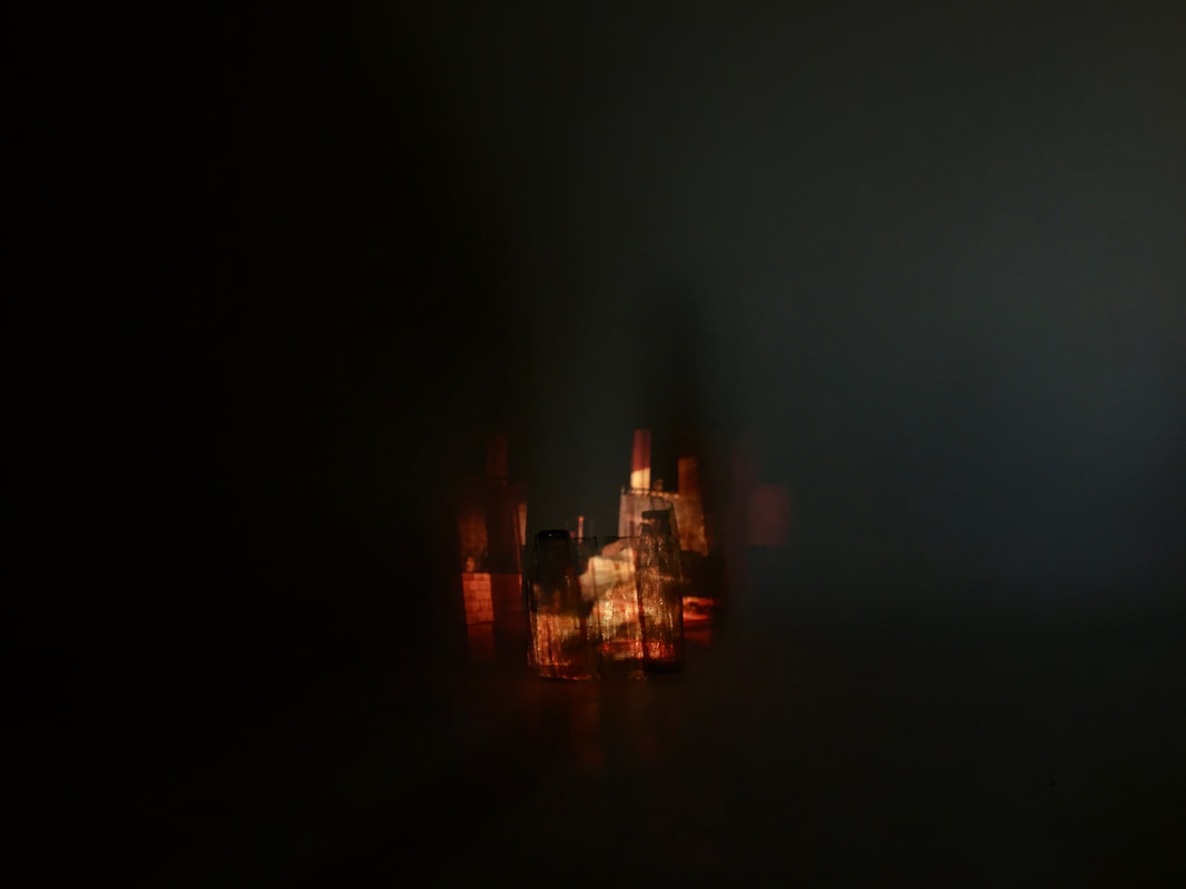
Photoshoot: First attempt at abstraction
I started experimenting with a magnifying glass, because I like the contrast between the clear, sharp and realistic looking objects and the ones you can see in the magnifying glass, because they are very blurry and enlarged and have a rainbow tint around them, as if they are underwater. I like the colours, these photos are quite soft looking. I really want to edit these photos to make them seem more abstract, also I wish I had taken more photos with the same idea but different objects.


Research
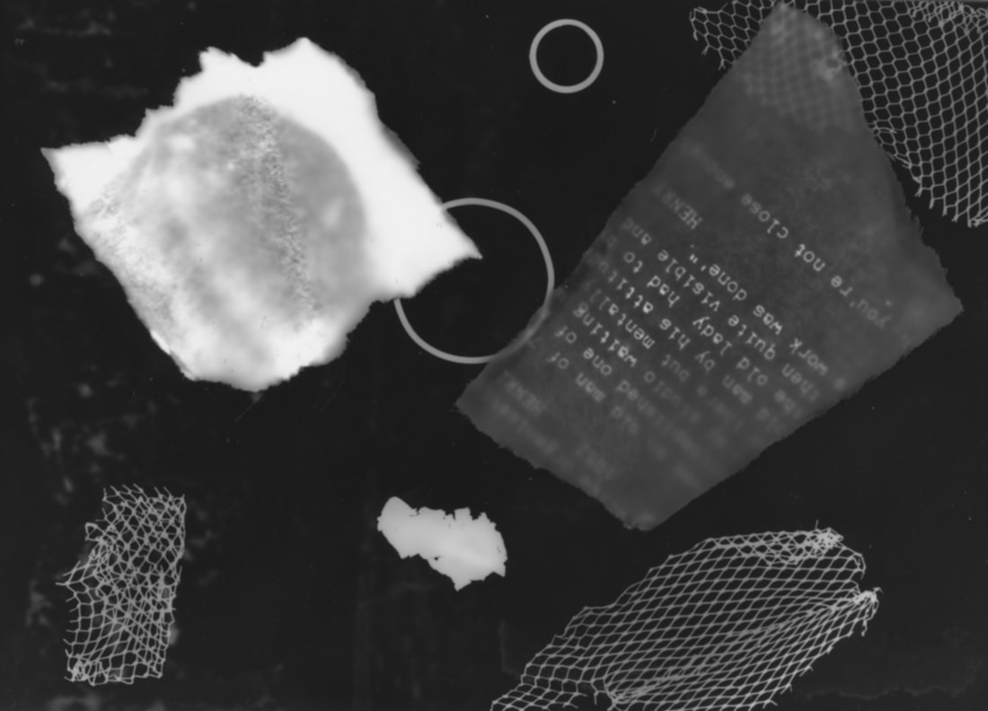
Photograms
A photogram is made by placing objects on light sensitive paper and shining light on them. The light doesn't go through the objects, instead leaving a blank space out lining the object.however, if an object is not very dense, the light will go through, and leave a darker print on the paper.
I like the way that the objects almost seem to be floating through space, and even though it was a mistake, I like the tiny white dots on the paper where the dust has left a print, because it looks quite interesting.
I wish that I had made more photograms, and maybe used less recognisable objects.
I like the way that the objects almost seem to be floating through space, and even though it was a mistake, I like the tiny white dots on the paper where the dust has left a print, because it looks quite interesting.
I wish that I had made more photograms, and maybe used less recognisable objects.


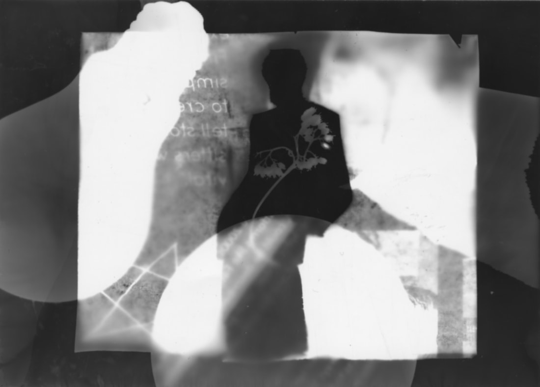
This is my favourite photogram, I like how it incorporates both of my ideas with the silhouette of the man and the different objects.
|
This is my least favourite photogram. I dislike the composition of it, all the objects seem oddly placed and I dislike how they all look together.
|
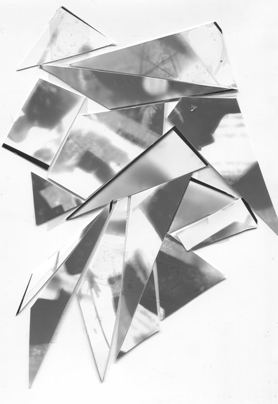
Photogram Experiments
|
< I decided it would be interesting to cut up a negative photogram and turn it into a positive. I think this worked well I like the way you can see the light coming through the edges and the way its been turned black.
|
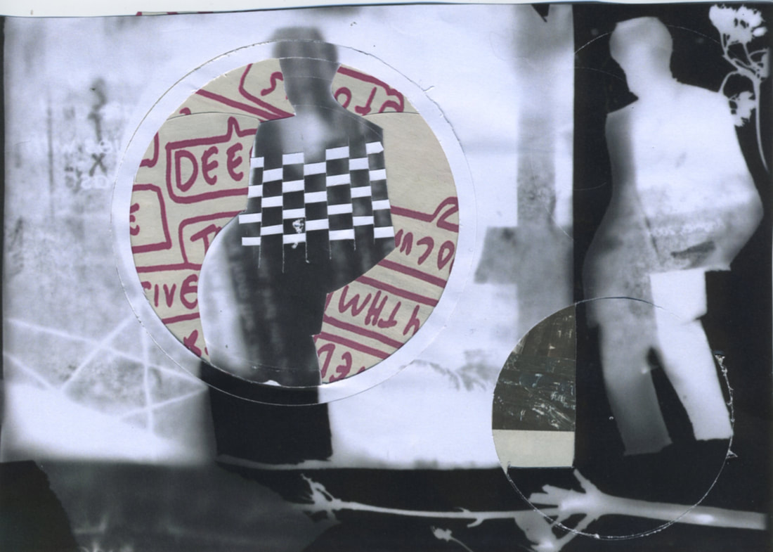
Duotones
With this photograph, I combined three different pictures together. I think this is interesting because only one image has any colour, which contrasts with the black and white photogram.
|
|
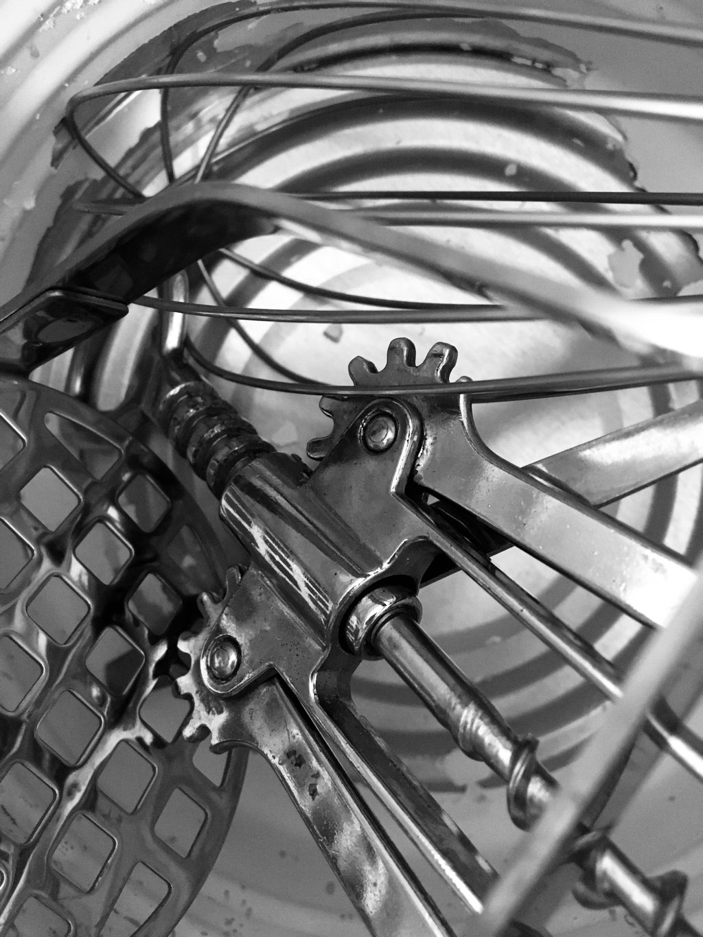
Jan Groover
|
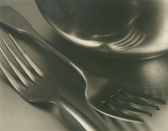
I have recently discovered Jan Groover, and I think that her photos are very abstract due to her use of negative space to create a photograph that is very confusing as it's hard to tell where the objects end and the negative space begins. She uses reflective surfaces that mirror the objects and create a warped version of the image using light.
Jan Groover was an American photographer. She started her career as an artist but switched to photography later on. Her kitchen still life photographs depict a series of ordinary kitchen utensils and turn them into something unrecognisable. Her photographs are very formal, yet elegant. |
|
Jan Groover Response
|
Albert Renger-Patzsch
|
Albert Renger-Patzsch was born in the late 1890's and he began creating photographs at the age of 12 years old. He published his first book , The choir stalls of Cappenberg, in 1925 after becoming a freelancer. He had his first exhibition two years later. A year after that, he published a second book entitled ' Die Welt Ist Scön ', which means ' the world is beautiful '. This book consists of a collection of photographs that explore the natural order of the world, but also the complete opposite, the world of machines and manufacturing. The contrast of these two subjects is interesting, organic and man made, but he finds beauty and organisation in both. Renger-Patzsch's experience with the first world war is one of his inspirations for this series. After the war, there were two kinds of responses. The first was dadaism, where people were anti-art, and the second was like Albert Renger-Patzsch, where he wanted order restored to everything and to show that there was still beauty in the world.
|
|
DAFNA TALMOR WORKSHOP
|
Dafna Talmor was born in Israel and moved to Venezuela when she was young. She takes inspiration from moving around, as photographs create a permanent memory of the places and things that she left behind and she is interested in the construct at home, as she has so many places that are her home. On her travels, she ends up taking photographs of landscapes as a way of preserving a piece of land for her to keep.
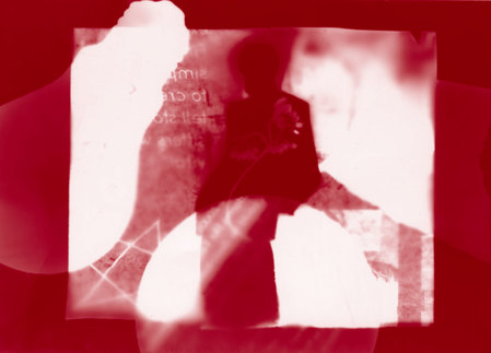
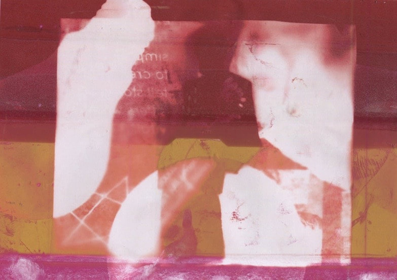
Dafna Talmor has three main bodies of work ; her first, entitled obstrcted views, is a seires of self portaits all photogaphe indoors. In this collection, she focused on taking photographs inside , and used to hint at the idea of an outside world. She was fascinated by the limitations that were presented in taking photographs inside. Her photos link to the history of photography, of combination printing. Combination printing is the practice of using two or more negatives to create a picture. Talmor combines positives and transforms quite ordinary photos into amazingly abstract images. |
|
Assessment
|
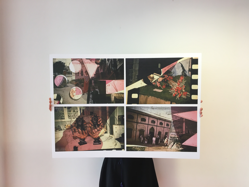
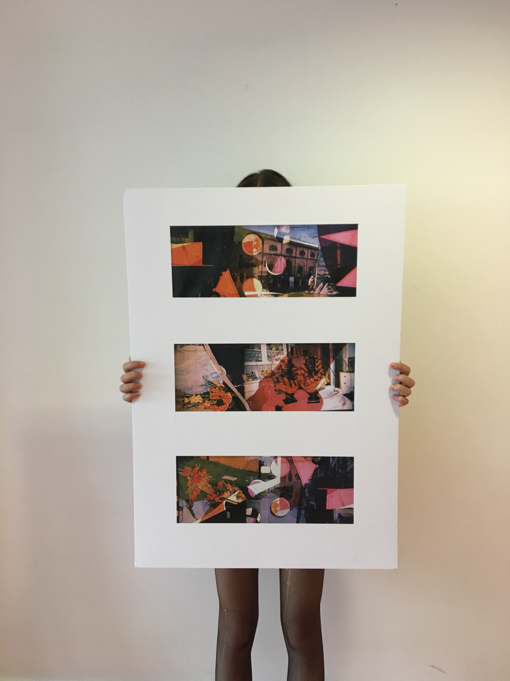
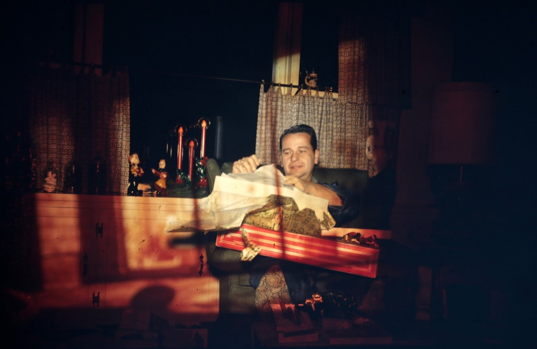
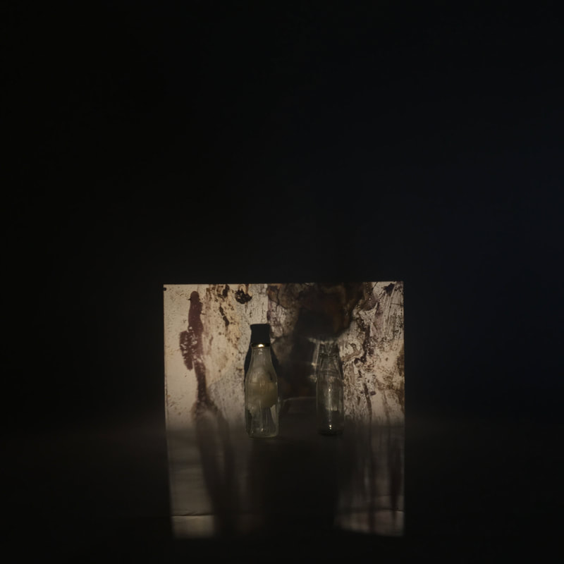
For my final outcome, I wanted to incorporate some ideas from Dafna Talmors practice. I liked how she used slides and constructed new prints out of old prints and I wanted to see if there was another way I could abstract slides. I decided to experiment with some slides I had already made by projecting them onto a backdrop. I placed objects infront of them to disrupt the image.
|
|
|


Final